Category: Creative, Art, and Design
Logo should be simple, not loud and most important of all, it must be easily recognized. Perhaps the best logo is the one where it has the ability to capture a person’s emotion. Without further ado, here are 18 badly designed logos.
1. Dick Busch Architects
Dick Busch Architects, with a name like this, it is advisable to avoid logos that resemble a dick. Perhaps the architect (or the graphic designer) thought there is no such thing as bad publicity as long as it is free. One thing for sure, everyone in the construction industry will know these architects. Whether they will be taken seriously is a different issue.

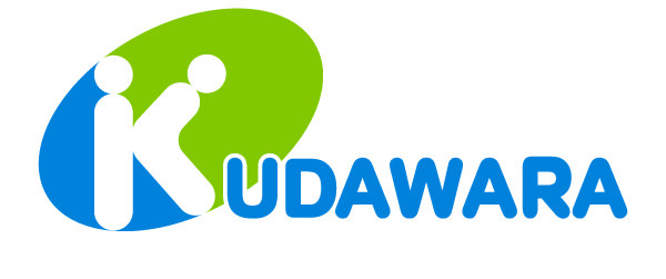
2. Kudawara Pharmacy
This pharmacy in Japan says it all, use your imagination.
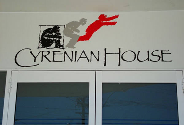
3. Cyrenian House
Cyrenian House is a not-for-profit non-government organisation that has been operating within the alcohol and other drug treatment sector since 1981. Depending on your interpretation, it can be viewed as a person breaking out from a box or someone leaping to their death.
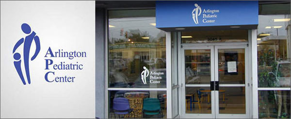
4. Arlington Pediatric Center
Arlington Pediatric Center redesigned their logo after receiving bad publicity over the previous logo as shown below. Their mission is to provide a Medical Home offering family-centered care in a culturally-sensitive environment, unfortunately, the logo is somewhat subjective and if viewed from a dirty mind, it resembles something nasty.
5. Junior Jazz Dance Class
This is a very good example of a badly designed logo, rule number 1 in design – always asking for a second opinion. Sometimes when they are so into something, they become delusional, therefore not being able to see the other side of something. Anyway, almost half of all people will first see a naked woman’s torso here. What was supposed to be 2 person dancing turns into a nightmare for the dancing class.

6. Pepsi
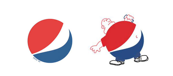
It is supposed to resemble a person’s mouth burping after drinking Pepsi. It is not exactly a bad logo, but the way some people see it is equally important. The last message Pepsi wants to convey to the general public is associating their drinks with obesity.
7. Instituto de Estudos Orientais
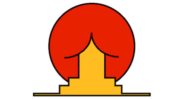
Supposedly a simple logo that portrays an Asian building with the rising sun behind it. The institute is about oriental studies, possibly about Japanese language and culture. The curved roof somehow distorted the whole image, it is rather ironic since curved roofs are not a feature in Japanese architecture, they are mostly straight pitched roofs. Use your imagination.
8. Market Place & Cafe
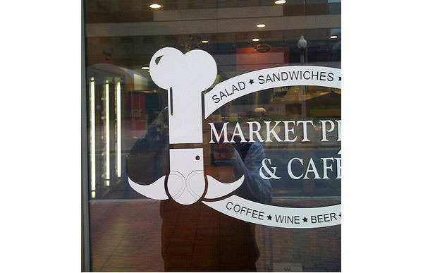
I wonder what they serve in the cafe? Please cum in.
9. Catholic Church’s Archdiocesan Youth Commission
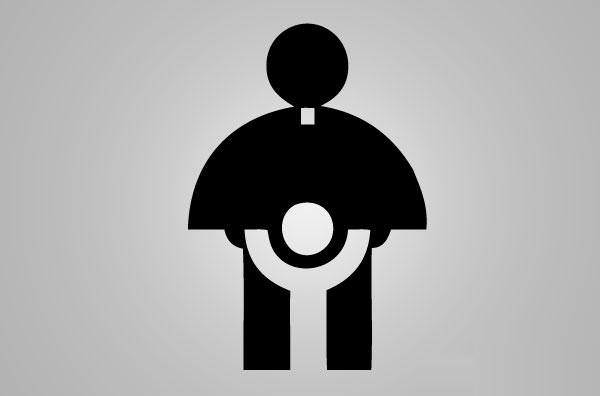
Designed in the 70’s, before the scandal on Catholic priests abusing little boys gained momentum. Back in the good old days, it even won an award from the Art Directors Club of Los Angeles.
10. Office of Government Commerce
The OGC website no longer exists, but whatever appears on the internet stays on the internet forever. Silence is gold, words are silver. This must be the most silver-ish logo ever, when tilted 90 degrees, it resembles an action by a male person.

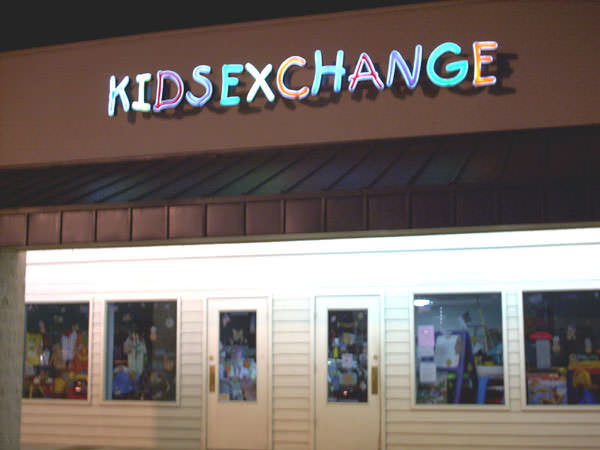
11. Kids Exchange
Sometimes all cap fonts don’t work, is it KidsExchange or KidSexChange? Some words are more prominent and sensitive to us, such as free, best, win, and etc. Those are what they called eye-catching words and can be detected by their brain instantly.
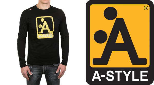
12. A-Style
This may be a badly designed logo from a long term point of view, but to gain publicity, they believe it was intentionally designed to be controversial. The A-Style logo appears in public before the launch of the clothing line. The yellow sticker with the logo started to appear in various cities around the world, this subjective logo has a curious touch to it and went viral, free publicity.
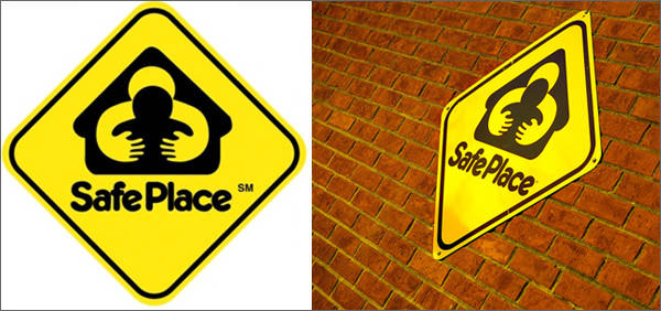
13. SafePlace
Safe as in grabbing and groping from behind? Or a person shielding someone by hugging the other person? I guess it is not such a safe place depending on your imagination.
14. Mont-Sat Mascot
This explains why the Mont-Sat Mascot appears to be happy all the time.

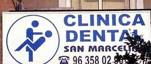
15. Clinica Dental
Not your usual dentist, bonus free service.
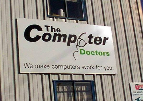
16. The Computer Doctor
They’ve redesigned their logo, this previous logo where the ‘U’ is an icon of a mouse, but to a person with a dirty mind, it resembles something else.
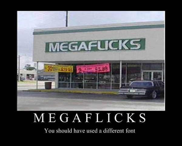
17.- MegaFlicks
Perhaps a bad choice on the font, which reminds me on the same problem I had with a store in my neighbourhood – BLIMCITY or BUMCITY. I still do not know if it is LI or U due to the font.
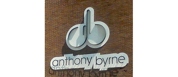
18. Anthony Byrne
No big deal, they are all adults, but, this is simply a bad logo for furniture you want to put in your house. Anthony Byrne is still using the same logo, perhaps they don’t mind the bad publicity.


I appreciate the giggles but this article is so poorly written that I can’t even share it. I would suggest reviewing before you hit publish.
Thanks for the suggestion. not sure if you are a bot spamming or a genuine comment, none the less, we’ll try to improve any future articles before we hit the publish button. thanks again.
I just went straight to the pictures. No need for interpretations.